tensix-viz
affiliated★ featured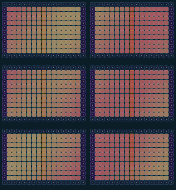
Hardware topology visualizer for Tenstorrent chips — from individual chip to full cluster. Interactive JavaScript visualization of Tensix core layout and NoC connections.
📋 Changelog
# Changelog

All notable changes to tensix-viz are documented here.

## [1.3.2] - 2026-09-28

### Fixed

- **Cluster views no longer collapse to their caption's width**
  (`src/cluster.js`). Cluster tiles are empty divs with no width of their own,
  so a shrink-to-fit parent sized the whole widget to its one-line spec text —
  Galaxy SC's 128 chips rendered as 2.7px dots. The tile grid now gets a
  preferred width from its column count (32px tiles, or 10px dots above 64
  chips) and `max-width: 100%`, so it still shrinks on phones.
- **Zoomed cluster breadcrumb no longer covers the spec caption**
  (`tensix-viz.css`). `.tv-cluster.tv-zoomed-in` reserves room at the top for
  the "Cluster › Server N" breadcrumb.

### Docs site (landing page)

- Hero and two-column sections now stack at 1120px instead of 900px. Between
  those widths the QB2 hero chips were squeezed to ~120px and the Memory code
  block hid up to ~140px of each line; the hero now gets full 340px chips there.
- Code blocks wrap at ≤800px instead of hiding most of each line in a sideways
  scroll box (the Quick-start block hid ~400px per line on a phone).
- Phones: tighter padding around the hero system (chips 85px → 119px at
  375px wide), and `kernel_dispatch` may wrap so the mode table fits.

## [1.3.1] - 2026-09-28

### Fixed

- **Chips in a card/system no longer come out at different sizes**
  (`src/card.js`, `src/chip.js`). `TensixViz` caps its drawing size to its
  parent's `clientWidth` once, at construction. `CardViz` builds chips one at a
  time into a flex row, so each chip measured the room its predecessors had
  left — on the docs hero, QB2's second chip in each card rendered at roughly
  half the size of the first. Card chips now pass the new
  `fitContainer: false` option and keep their full logical size; CSS fits them
  (`.tv-chip-wrapper { flex: 0 1 auto; min-width: 0 }`).
- **Shrunk canvases are no longer squished.** The inline `style.height = Hpx`
  overrode `.tv-chip-wrapper canvas { height: auto }`, so whenever
  `max-width: 100%` narrowed a canvas its height stayed put (aspect ratio 0.8
  instead of 1.42). Canvases now get `max-width: 100%`, `height: auto` and an
  explicit `aspect-ratio`, so they scale cleanly after construction too.
- `.tv-card`, `.tv-system`, `.tv-card-wrapper` and `.tv-cluster` can shrink to
  their container (`max-width: 100%` / `min-width: 0`).

### Docs site

- Hero and "chip anatomy" grids use `minmax(0, 1fr)` tracks; a bare `1fr`
  couldn't shrink below the Memory section's `<pre>`, which pushed the page
  sideways even on desktop.
- The mode reference table scrolls inside its own box on phones.
- Hero theme buttons are grouped with the canvas they theme (they were a stray
  third grid cell under the hero text).
- Examples: demo cards can shrink below their canvas's preferred width, page
  padding scales down on phones, and the theme toolbar wraps.

## [1.3.0] - 2026-09-24

### Added

- **`setActivity(value)` and `setProgress(value)`**
Works on
wormhole
blackhole